Numbers does let you add reference lines to charts. The problem is that you have to specify a direct value - the reference line value cannot be a cell reference or other formula (maybe this is worth a note on https://apple.com/feedback/numbers.html asking for dynamic reference lines), and it only works for certain chart styles.
To add a reference line, select your chart and go Inspector -> Axis -> Add Reference Line -> Custom

And enter the value.
An alternative method would be to overlay a second chart.
In this example, I took data from my (dummy) table and added a 'Reference' column:
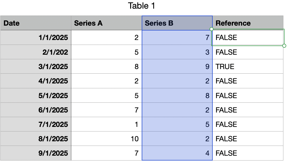
The 'Reference' column can actually be anything, but I set a formula that sets TRUE if the Series B value is MAX(B):
@C=MAX(C)
But this can be any formula, or a set of checkboxes.. anything you like.
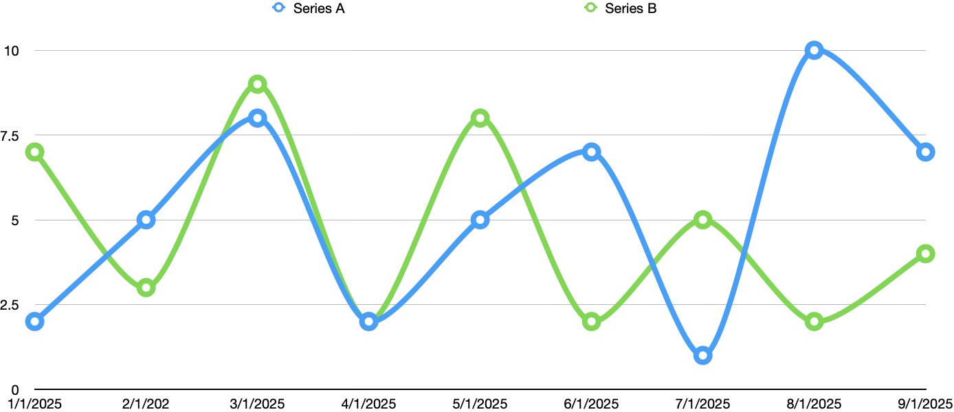
I then create one chart off the Series A and Series B columns:

Then create another chart using the Reference column only:
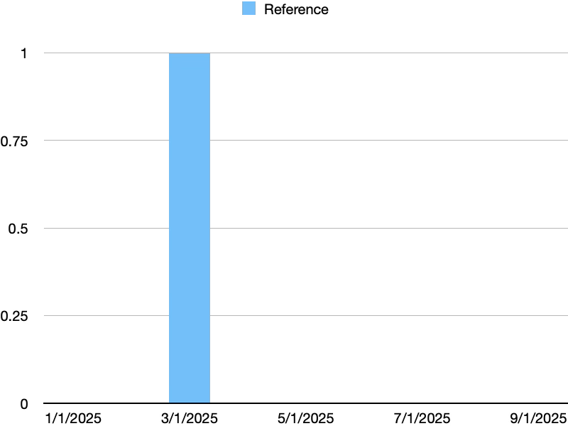
Initially, it's not helpful but with a little formatting you can:
Turn off Y Axis Labels (Inspector -> Axis -> Value -> Value Labels -> None
Turn off X Axis Labels (Inspector -> Axis -> Category -> Value Labels -> None
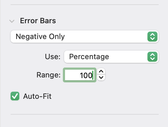
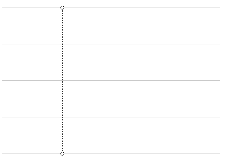
Then select the sole column and choose Inspector -> Series -> Error Bars -> Negative Only -> Percentage -> 100%:
Then hide the blue bar via Inspector -> Style -> Fill -> No Fill
Finally, select the Error bar and choose Inspector -> Error Bar and set the Bar Style to dashed:

Now what you have is a chart that shows a single dashed line for whatever row in the Reference column is TRUE (or checked:
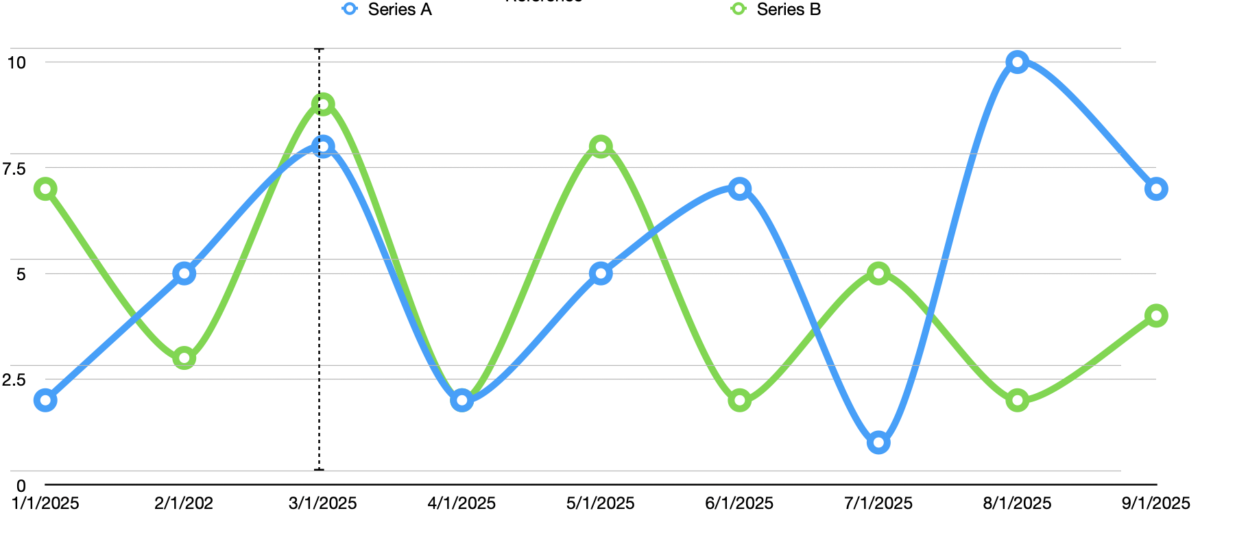
Boring as anything, but you can now overlay this on top of your other chart and get what you're looking for:
Hope that helps.